The purpose of this project was to create a logo and sub-logo for a family sports team. Once the logos were developed, an identity system, team uniforms, and brand identity guidelines were made.
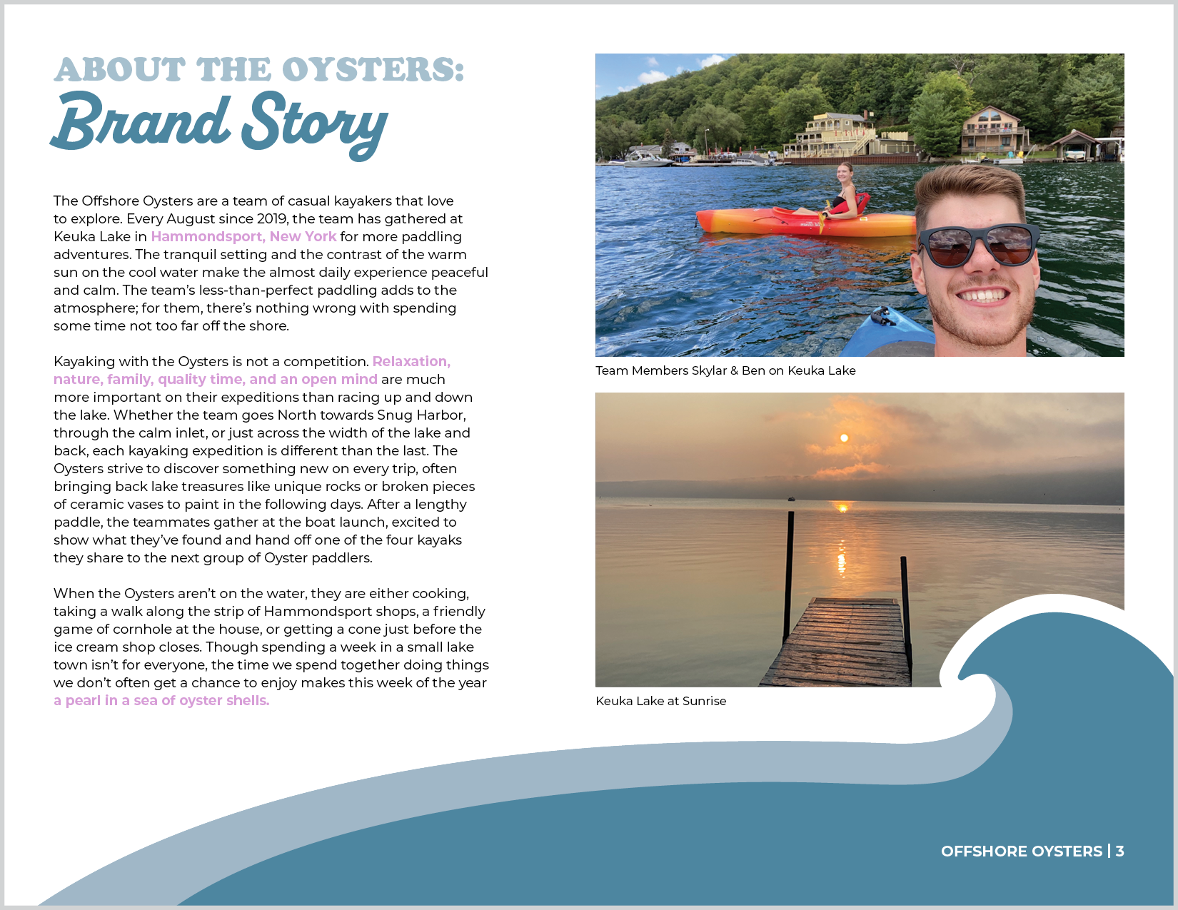
The Offshore Oysters are an informal family sports team of casual kayakers that love to explore. Every August since 2019, the team has gathered at Keuka Lake in Hammondsport, New York for more paddling adventures. The tranquil setting and the contrast of the warm sun on the cool water make the almost daily experience peaceful and calm. Though spending a week in a small lake town is not for everyone, the time they spend together makes this week a pearl in a sea of oyster shells.
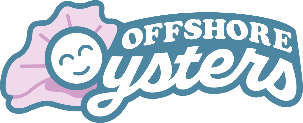
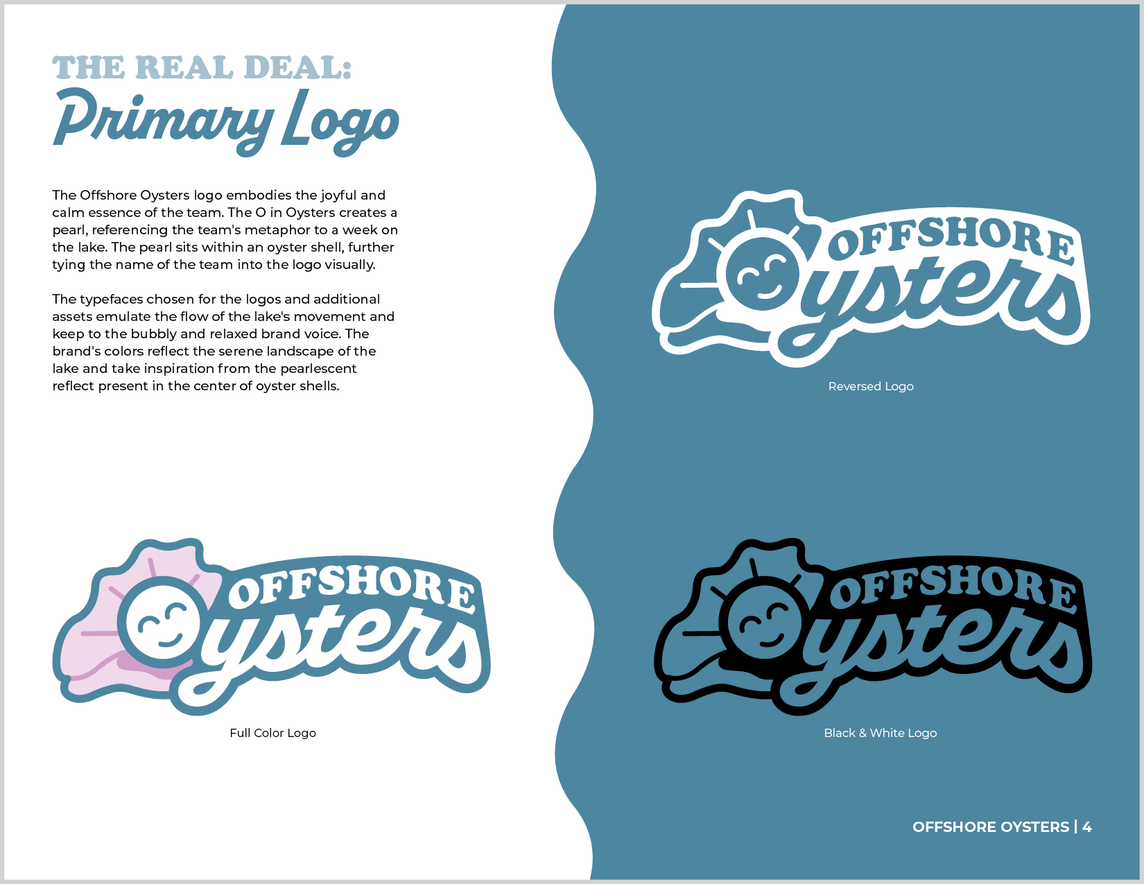
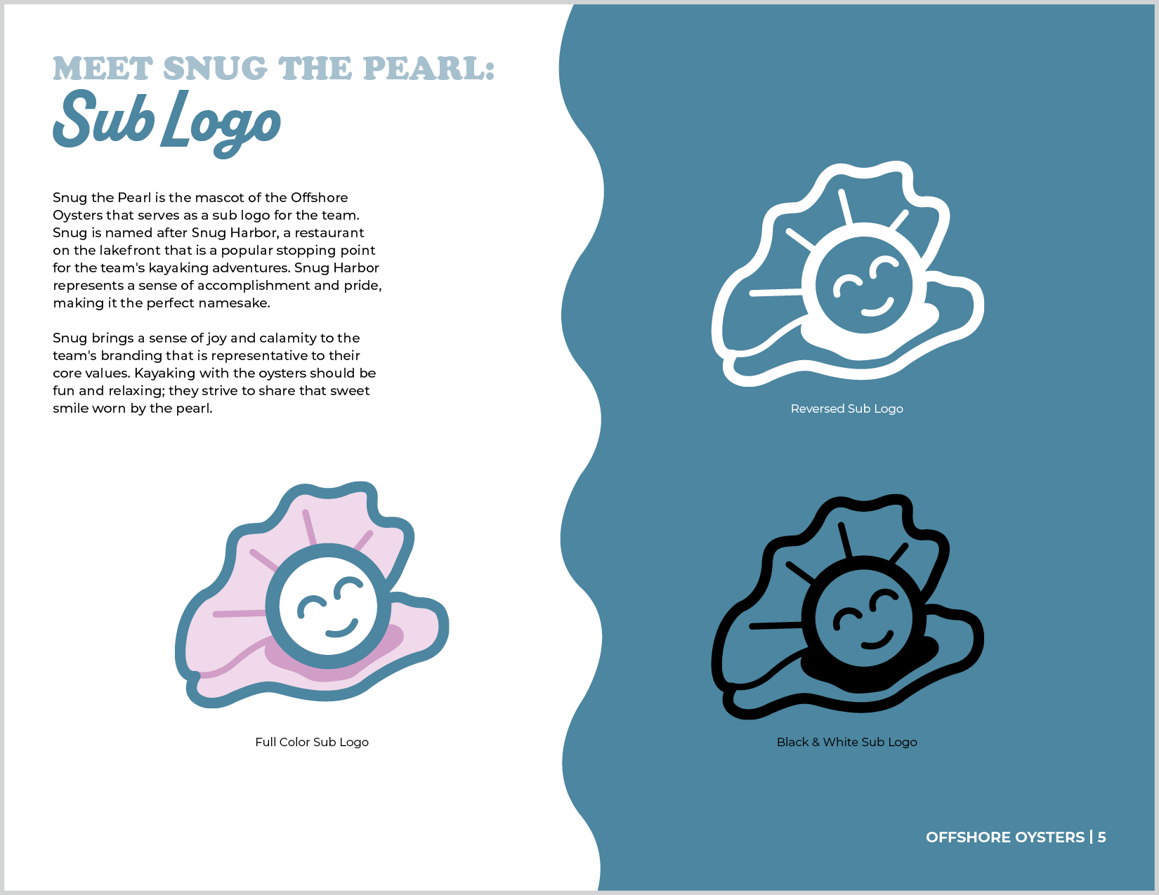
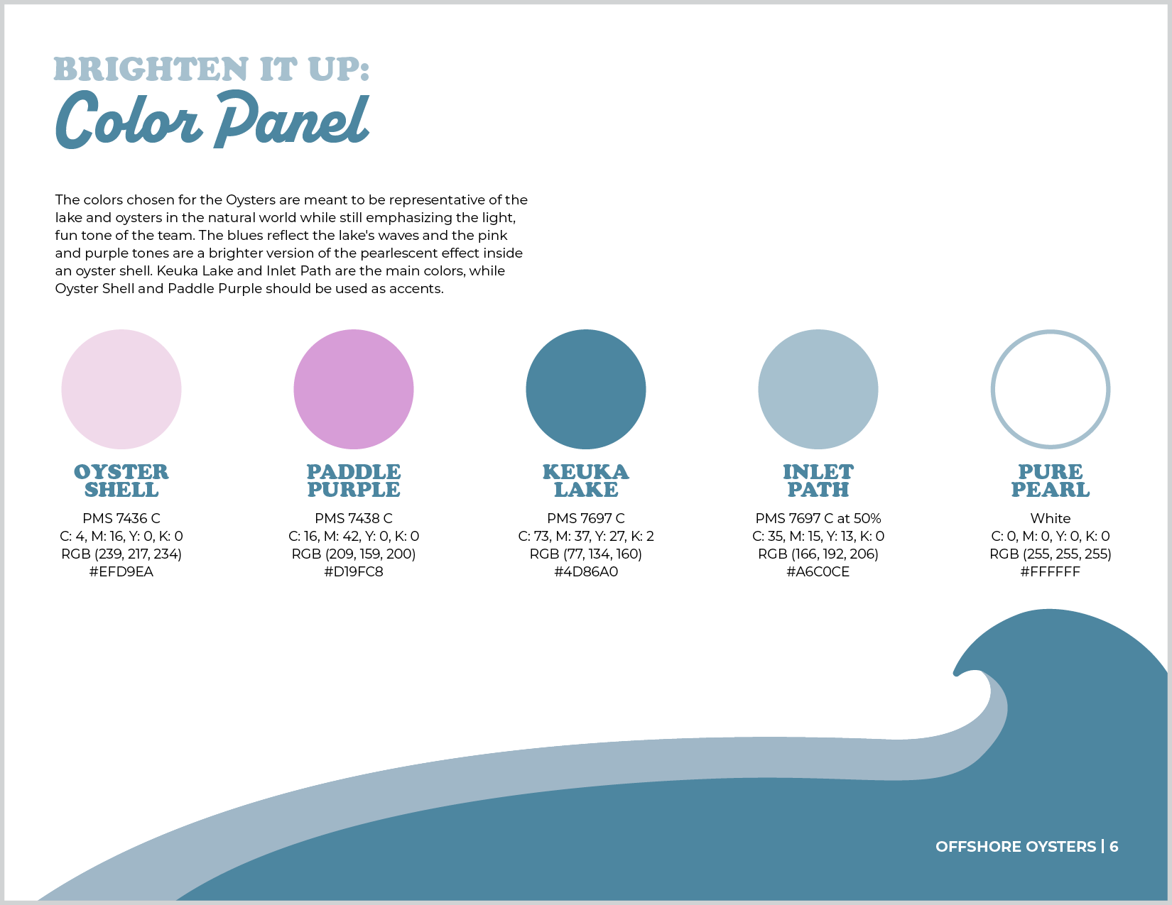
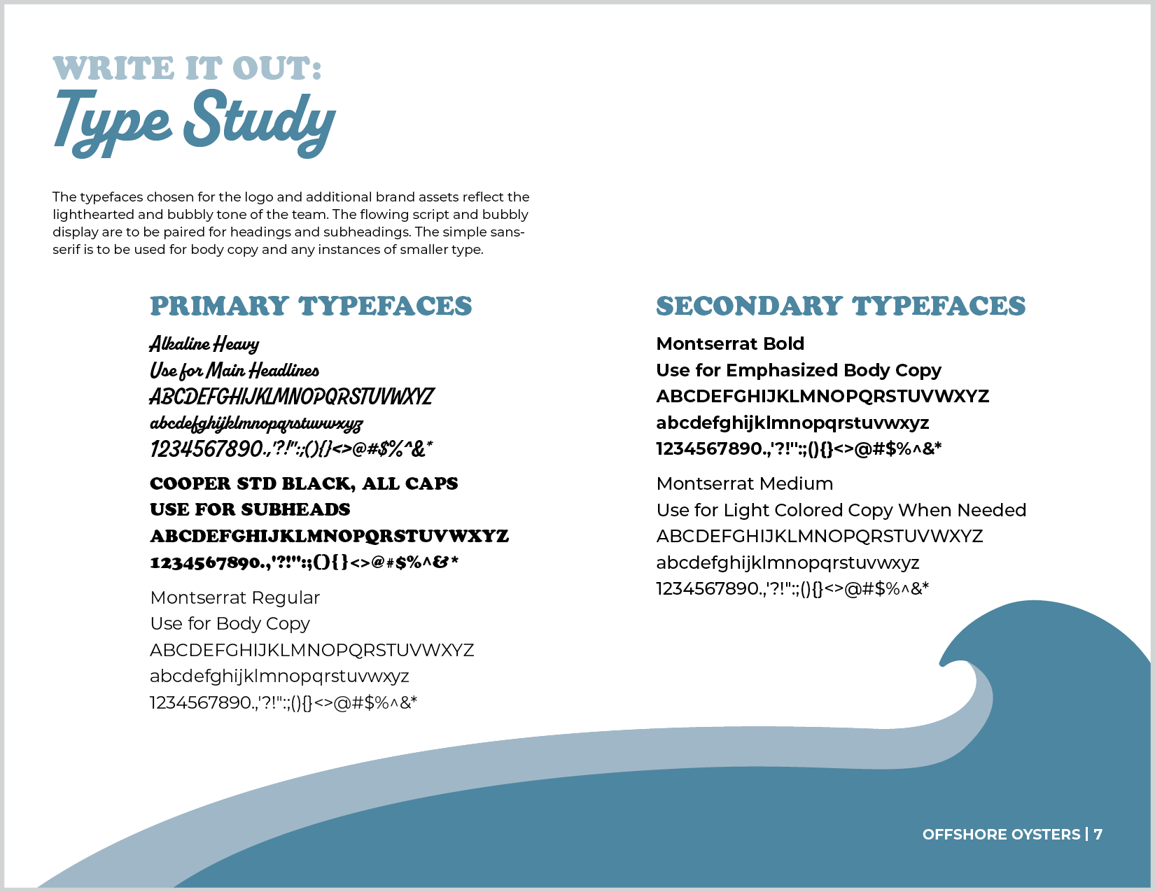
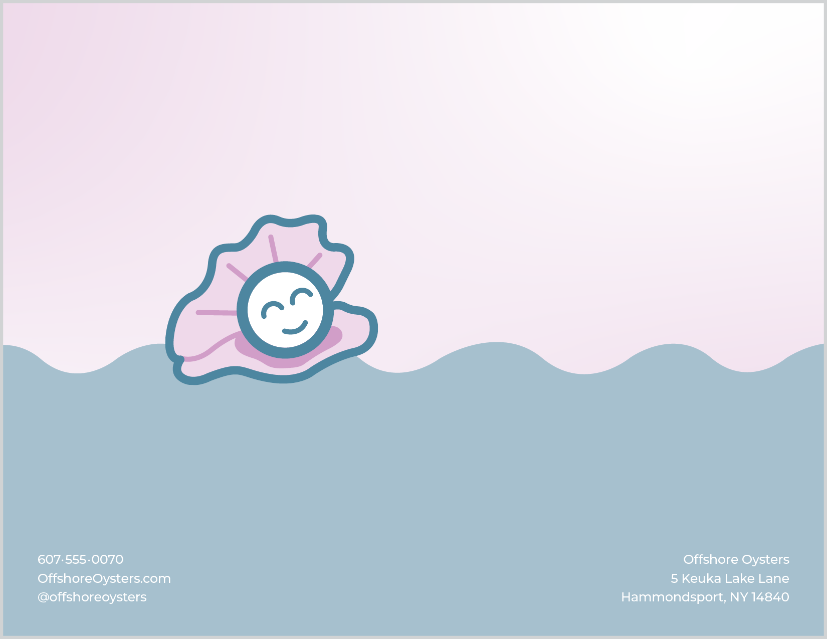
The colors used throughout the project are reflective of the calm, relaxing tone of the team while mimicking what could be found in nature. The typefaces are playful and similar to those used in traditional sports logos. Snug, the mascot, is used alone as a sub-logo and shows the casual atmosphere of the sport and adds personality to the brand’s identity. The oyster’s name comes from Snug Harbor, a restaurant on Keuka Lake, to tie the history of the team directly into the branding.

Primary Logo

Sub Logo
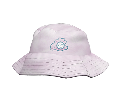
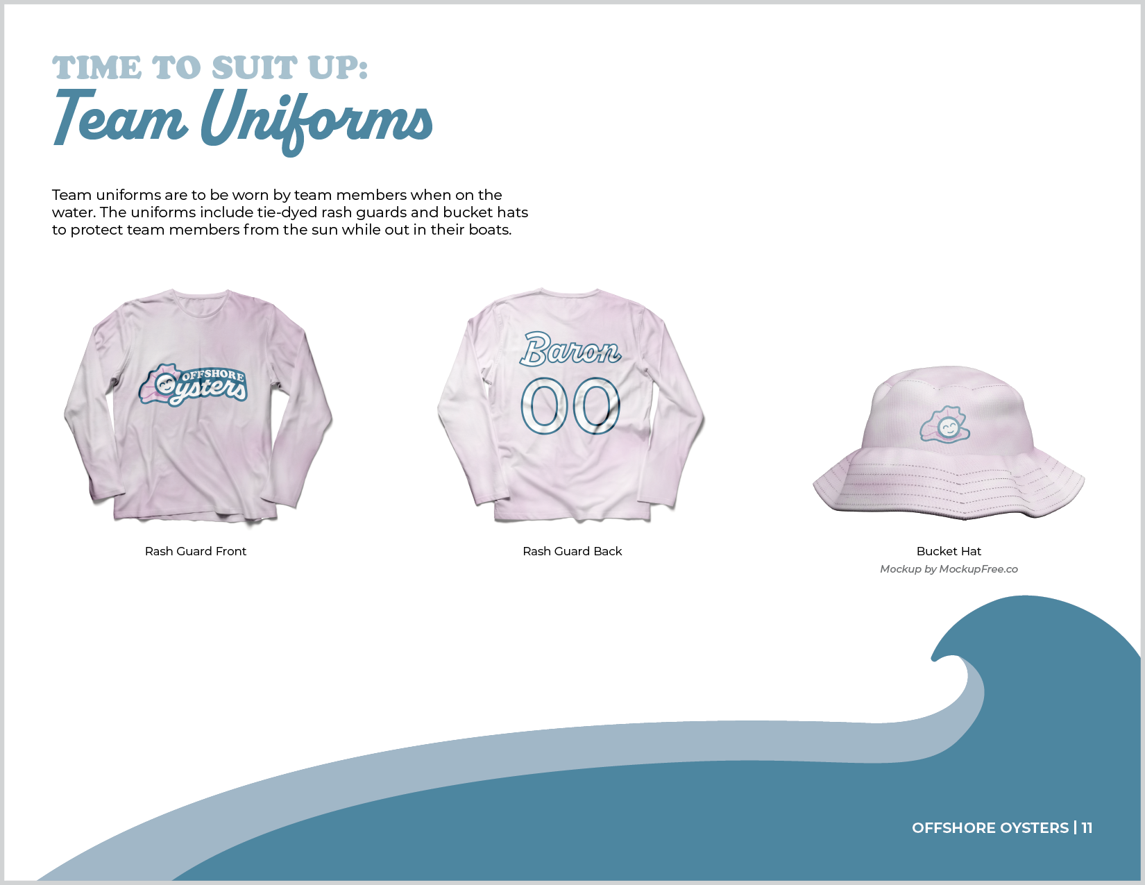
Team Bucket Hat
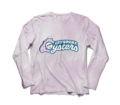
Team Rashguard Front
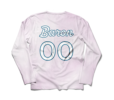
Team Rashguard Back
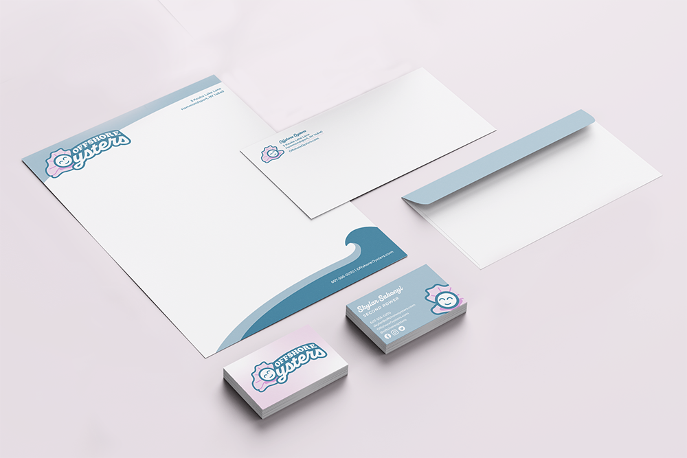
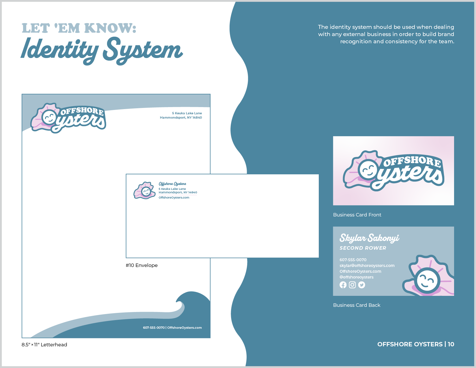
Identity System
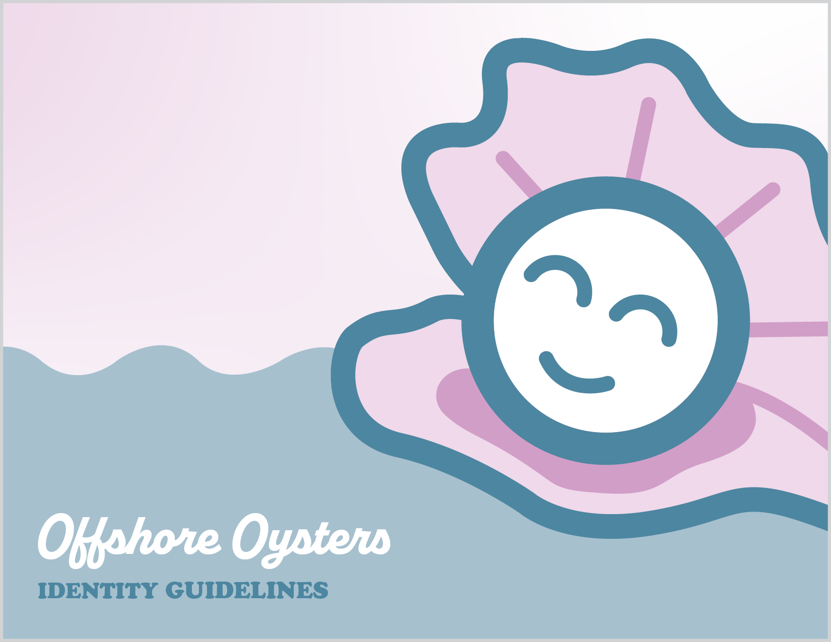
Brand Guidelines


